Third Bearing · brand guidelines · version 1.15 · October 2026

Bearing Identity System.

The brand of an experimental studio, written as an instrument. Turn it to read it.

Scroll once, drag the dial or press →Swipe or turn the dial

00

About this document

Bearing Identity System is version 1.15 of the Third Bearing brand guidelines. Every chapter has two sides: experience, which you can turn, touch and play, and spec, which you are reading now.

The experience is for people meeting the brand. The spec is for people producing it: sizes, colour codes, files and rules. The two sides always say the same thing.

v1.15 keeps every rule of v1.1. What changed: the brand pattern. The Truchet field of quarter arcs, which every generated pattern now looks like, is replaced by Section: the bearing drawn as a cut, the way a drawing office draws one, from the mark's own numbers. Meet, the game in chapter 09, is played on it.

OwnerMuhammad Aditya Wisesha, Founder
CompanyPT Poros Orbit Ketiga, Bogor
Version1.15 · 5 October 2026
StatusPrivate to the studio. Not for publication.
Masterbrand-identity/v1.15/index.html
Printbrand-identity/v1.15/bearing-identity-system-v1.15.pdf

Controls

← → · one scroll · drag the dialPrevious or next chapter. One scroll gesture is one chapter.
SFlip between experience and spec
IChapter index
GShow the module grid and the 12 columns over everything
LLite mode: fewer particles, simpler Codex (automatic on phones)

01

Manifesto

Art pulls one way.

We work in the friction between them.

Design pulls the other.

Drag sideways. Too little friction and we disappear. Too much and we break up.

  1. The idea comes first. The medium follows.
  2. We write down what others overlook. The notes are part of the work.
  3. We don't follow a style. We keep a direction.
  4. Some of it is product. Some of it is art. Some of it we can't name yet.

01

Manifesto

Art pulls one way. Design pulls the other.
We work in the friction between them.

  1. The idea comes first. The medium follows.
  2. We write down what others overlook. The notes are part of the work.
  3. We don't follow a style. We keep a direction.
  4. Some of it is product. Some of it is art. Some of it we can't name yet.

What changed in v0.4

The v0.3 manifesto had nine paragraphs. v0.4 keeps its ideas (art and design, friction, concept first, notes, direction over style, not knowing) in one thesis and four lines. Short sentences, no metaphors to decode.

How to set it

The thesis may be set large. Its second line is the one Apsis line of the view; the rest is Nitride. The four lines are set as a numbered list, never as a paragraph. Lines may be quoted on their own, credited as /item: manifesto, line n. Never reworded.

Where it lives

The website root, the back of the tee, the first page of every codex. zine, and the red chapter of this document. Red Hot Bearing may be the whole background here and nowhere else with text.

02

One name, three bearings.

In a sentence it is Third Bearing. As a logo it is thirdbearing. The work runs through three sub-brands. Point at one.

  • studio. Brand identity, graphic design, art direction, retainers. Work made with and for others.

  • objekt. 3D modelling, 3D printing in FDM and resin, silicone moulds, custom objects. Things you can hold.

  • codex. Experimental code, digital, AI, generative work. Research, notes, archive. Free to break the rules.

02

Name & brand architecture

One name, written two ways. In a sentence it is Third Bearing. As a logo it is thirdbearing. The two never swap places.

The parent brand is Third Bearing. The legal entity is PT Poros Orbit Ketiga; it appears on contracts, invoices, letterheads and the copyright line of legal documents, never as a logo.

The parent holds three sub-brands: studio., objekt. and codex. “Studio” is a sub-brand, not part of the parent name.

WhereWriteNever
Running textThird Bearingthirdbearing · ThirdBearing · Third bearing · THIRD BEARING
Logothirdbearing, the drawn wordmark, never typedThe wordmark set in a font
LegalPT Poros Orbit KetigaPT Third Bearing · Third Bearing Studio (as a company name)
Sub-brand in textThird Bearing objekt. / objekt.Objekt. · objekt (no full stop) · Object
Sub-brand ending a sentence“The mould is made by objekt.” (one full stop)“…by objekt..”
Copyright line© 2026 Third Bearing. All rights reserved.2026 © ALL RIGHTS RESERVED - Third Bearing Studio
Handle@thirdbearing · instagram.com/thirdbearingthird_bearing · 3rdbearing
Spec labels/subjkt: /item: lowercase, with colon/Subject: · SUBJKT

Sub-brands and services

Sub-brandServicesTone
studio.Brand identity · graphic design · art direction · retainerClear and calm
objekt.3D modelling · 3D printing FDM (PLA+, PETG, ABS, TPU) and resin (standard, ABS-like) · silicone mould making · custom physical products · small editionsPrecise and tactile. Numbers and materials first.
codex.Experimental code · digital · AI · generative work · research, notes, archiveCurious, free

printing. is retired in v0.4. Everything it offered is now objekt.: a print is an object too. The tb-lockup-printing-* files stay in the repository for old v0.3 material only; do not use them for anything new.

How the lockups are built

Wordmark on top. Descriptor below in Apsis Bold with the turned e (studio. objəkt. codəx.), kerned, tracking −8 units, in the accent colour, ending in a full stop. The descriptor's x-height is fixed and its full stop lines up with the right edge of the g. From v0.8 the descriptors are drawn from the studio's own Apsis; the files shown here are in brand-identity/v1.15/lockups/, and the masters in assets/brand/svg/lockup/ follow once the owner signs off.

When to use which

Use a lockup when the piece belongs to one sub-brand only. Use the plain wordmark for anything that speaks for all of Third Bearing: the website root, contracts, the manifesto. Never put two lockups side by side; list the sub-brands in type instead.

studio. lockup
tb-lockup-studio-*
objekt. lockup
tb-lockup-objekt-*
codex. lockup
tb-lockup-codex-*

03

Mark, logotype & rules

Symbolism

(1) and (2). Two construction circles sit on opposite corners of the grid. Read them as art and design. Each cuts into the shape from its own side. Neither reaches the centre.

housing (a), housing (b). What the circles leave behind are the two housings: identical, turned 180° against each other. Nothing in the mark leans to one side.

(third). The dot in the middle is the bearing: the studio. It is held by both housings and touched by neither. The ring of empty space around it is the friction the manifesto talks about.

Construction

Grid unit uDiameter of the centre dot
Overall3u × 3u, square
Ring (empty)Outer radius 0.95u
Construction circles (1), (2)Radius 1u, centred on opposite corners
Corners0.047u outside · 0.11u at the ring
Symmetry180°: housing (b) = housing (a) turned

Shapes from the v0.1 vectors: 98.1% overlap for the mark, 99.2% for the wordmark.

Clear space & minimum size

ArtworkClear spaceScreen min.Print min.Below that
MarkX = u on every side24 px7 mmtb-mark-small-* down to 16 px
WordmarkX = width of the superscript mark96 px20 mmUse the mark alone
LockupsSame X160 px35 mmUse the wordmark

Every SVG, PDF and PNG already contains X on all sides. Place files edge to edge with other content and the space is kept.

Logotype

thirdbearing: one word, all lowercase, a heavy grotesque with tight spacing. Artwork, never typed. The two i-dots and the superscript mark carry the accent colour: Red Hot Bearing on light and dark, White Lithium Grease on red.

Vertical versions read bottom to top, for spines, sleeves and banners. mono-dark / mono-light are for one-ink jobs, embossing and laser.

Colour variants

Mark in red
Red, default, on light or dark.
Mark in White Lithium Grease on red
White Lithium Grease, on red, dark or calm photographs.
Mark in Dead Metal Spark
Dead Metal Spark, one-colour print, stamps.
Mark in Purple Flame
Purple Flame, light backgrounds only.

Misuse

Outside codex., none of these. Inside codex., see chapter 10.

Stretched wordmark
Stretch or squash.
Rotated wordmark
Rotate (only the 90° vertical exists).
Outlined wordmark
Outline.
Wordmark with drop shadow
Shadows, glows, bevels.
Wordmark with gradient
Gradients or new colours.
Purple mark on red
Purple on red (1.53:1).
Wordmark on a busy photo
Busy images without a calm area.
Invented lockup
Invented lockups.
Grey wordmark on light
Titanium Grey on light (2.42:1).

04

Mostly paper. A little signal.

Five colours, used in this ratio. Click one to copy it. Pick two to test them.

Text
On

We navigate.

codex. only · false-colour ramps

04

Colour

Extended palette

Tints mix toward White Lithium Grease, shades toward Dead Metal Spark, in OKLab. Each chip shows its contrast on White Lithium Grease / Dead Metal Spark.

Contrast matrix

WCAG 2.x: AAA ≥ 7 · AA ≥ 4.5 · AA-large ≥ 3 (text from 24 px or 18.66 px bold, and graphics) · below 3: decoration only.

Rules

  • Ratio 60 White Lithium Grease / 25 Dead Metal Spark / 10 Red Hot Bearing / 5 Purple Flame + Titanium Grey.
  • Red text on dark only from 24 px. Small red text on dark: Red 300 (7.19:1).
  • Titanium Grey is never text on light. Lines, guides and disabled states only.
  • Purple Flame on light is the safest accent text (7.17:1). Never on red or dark.
  • On red, text is White Lithium Grease, Book weight or heavier.
  • codex. is exempt: any colour, any ramp, inside codex. work only. The logo keeps its own colours unless the piece is labelled as an experiment.

Colour in print

ColourCMYKSpotNotes
White Lithium Greasenone9180 CThe paper, not an ink. Warm off-white uncoated stock.
Red Hot BearingC12 M97 Y100 K21795 CCheck 1795 U on uncoated: lighter and warmer.
Purple FlameC86 M85 Y0 K07672 COutside CMYK gamut. Spot ink for key pieces; always proof.
Titanium GreyC42 M32 Y29 K0Cool Gray 7 CLines and fields only.
Dead Metal SparkC73 M67 Y66 K82 (large areas)Black 6 CSmall text in K100, never rich black.

Uncoated stock, no gloss lamination, no foil. The brand is matt. Stationery 100–120 gsm; cards 350 gsm; posters 150–170 gsm. HEX is the master on screen; the spot ink is the master in print. For printed and cast objects (objekt.) the material colour is the master: match filament, resin and pigment to the swatch under daylight.

05

One wordmark, two voices.

Apsis and its four skins share every width and every angle, letter for letter, in every weight. A word can change its skin without moving. Type your own.

Skin
Weight
Friction.
Title · Apsis Bold · one per view
We navigate.An evening of work that is not sure if it is art or design.
Poster · Apsis Bold Italic on red
/item: film, chapter 2Poured twice.
Subtitle · Apsis Regular under a Nitride label
Descriptor · Apsis Bold with the turned e · the wordmark steps back
G1 X84.2 Y31layer 16 / 24
codex. label · Apsis Pixel + Line

05

Typography

Both faces are the studio's own, drawn for v0.8 from the wordmark. They share its large x-height (530 per 1000 units), so a line of Apsis sits on a line of Nitride without adjustment. Nitride takes the wordmark's level cuts and machined radius; Apsis takes its round dots and turns them into bearing balls, and steps every curve on a pixel grid.

Nitride

Text face: body, headings, labels, tables, UI. A grotesque with the fullness of a machined radius, formal and quiet next to industrial product. Its points are square pixels, as in Apsis, bitten from Bold up. Tracking 0 at every text size. Tabular figures (tnum) for numbers in tables. From 10 px. Its full system, and the variable file, are chapter 06.

Light 300We navigate.

Book 400We take notes on everything.

Medium 500The idea comes first.

Demibold 600Art pulls one way.

Bold 700Design pulls the other.

Black 900We work in the friction.

Every weight has an italic, slanted 8°.

Apsis

Display face: titles, subtitles, covers, posters, and the sub-brands beside the mark. A contrast serif drawn with a flat pen: thick verticals, hairline horizontals, one hairline throughout. Open strokes end in bearing balls, curves step on a pixel grid, the dots of i and j are bitten pixels, and the t and f bars stand off their stems by a constructed gap. Nitride does the work; Apsis interrupts it. One Apsis line per view.

UseSizeTrackingLeadingWeight
Display (covers, chapter titles)88–160 px · 30 mm+ in print−0.01 em0.96Bold, Bold Italic
Title (posters, sections)40–88 px−0.008 em0.96Medium, Bold, Bold Italic
Subtitle (films, captions of one line)24–40 px01.0Regular, Medium
Sub-brand beside the markFrom the lockup outlines——Bold, turned e

Below 24 px use Nitride. Never Apsis for body text, buttons or anything longer than two lines.

The turned e

objekt.objekt.

Apsis has one twist: an e turned half a turn, ə, like the mark's two housings. The plain e is the default, so titles and running words read as they are written. The turned e is feature ss01 (font-feature-settings: "ss01") and its own character, U+0259.

Use it for the sub-brands (studio. objəkt. codəx., as the lockups draw them) and for one word on a cover or poster. Never for a whole headline and never in Nitride, which has none. ss02 gives Apsis its cipher letters (a, e, t, r, g) for codex. and special occasions, ss03 the cipher e alone, and ss04 closes the gap in t and x. In Nitride, ss01 gives the single-storey a.

The Apsis skins

Apsis and its skins share metrics and every advance width: the red line above ends in the same place for every skin. A line keeps its length when its skin changes. The skins are cut in every weight of Apsis, Light to Bold, each with an italic slanted at Apsis's own 8°, so a word keeps its width and its angle when its skin changes. Mixing skins inside one word is a codex. move only.

FaceWhereStyles
ApsisThe brand's display face. Titles, subtitles, sub-brands, covers.Light, Regular, Medium, Bold, each with an italic
Apsis Pixel, Dotcodex. titles and labels; chapter numbers; the develop animation of this deck.Light, Regular, Medium, Bold, each with an italic
Apsis Line, MeshData labels and diagrams (Science Art Tech); codex. experiments.Light, Regular, Medium, Bold, each with an italic
Apsis KitThe codex. construction set: one key, one square tile. Patterns, dividers, arrows. Set solid.Regular

abbaabbaabbaabbaabbabaabbaabbaabbaabbaabkpqpkpqpkpqpkpqpkpqp5111111111111111112

Type scale (screen)

StyleFace · weightSize / leadingTracking
display-xlApsis · 7005 modules / 4.8 (≈ 100 / 96 px)−0.01 em
display-lApsis · 7003.3 modules / 3.2 (≈ 66 / 64 px)−0.008 em
display-mApsis · 7002.1 modules / 2.2 (≈ 42 / 44 px)0
headingNitride · 5001.2 modules / 1.5 (≈ 24 / 30 px)0
ledeNitride · 3001 module / 1.5 (≈ 20 / 30 px)0
bodyNitride · 40016 / 24 px0
smallNitride · 40014 / 20 px0
labelNitride · 50012 / 16 px0

Display sizes are set in modules, so titles grow and shrink with the grid. The fonts belong to the studio and live in the repository, in brand/typeface/ (OTF for design tools, WOFF2 for the web), with their specimen and build scripts. This deck loads them from there, so it and its PDF build on any computer.

06

Counted. Level. Quiet.

Nitride does the work. One variable file runs from Light 300 to Black 900, and every named weight in it is the static font, point for point. Drag the weight, type your own, and watch every line land on the grid.

Named

The idea comes first. The medium follows. We write down what others overlook; the notes are part of the work.

Body · Book 400 · 16 / 24

Poured twice, numbered by hand.

Heading · Medium 500 · 24 / 30

/item: mould, edition 04

Invoice · INV/TBS/2026/10/014

Label · Medium 500 · 12 / 16 · caps with case

Rp1.250.000

Rp 480.000

Total1.730.000

Figures · Book 400 · tnum in tables

04

Numeral · Black 900 · one per view

06

Nitride — the text system

Nitride is the studio's text face: body, headings, labels, tables, interfaces, every document in chapter 11. It is a clean industrial grotesque drawn on one grid, so its measures are counted, not judged by eye: every horizontal line in it is a multiple of one unit, every open stroke ends level on a line, and the six weights step by one ratio. Apsis interrupts; Nitride carries everything else.

One unit, seven lines

The unit is v, a tenth of the x-height: 53 of the font's 1000 units. The x-height (530) is the wordmark's and Apsis's, so a line of Nitride sits on a line of Apsis without adjustment. Ascender and descender both reach 4 v past the x-height band, which keeps lines close without the rows touching.

Open strokes end on the two terminal lines. The c, e and s stop on L and U, which cut the x-height 2.5 : 5 : 2.5; the figures 2, 3 and 5 stop on the same quarter lines of the cap height. That is why a line of Nitride looks level: its ends line up, letter to letter. The e's bar sits where its eye and its opening are the same height.

Round letters overshoot by v / 5 (capitals v / 4). Points (the dots of i and j, the full stop, the colon) are the stem's own square, its corner bitten from Bold up, the same mark as Apsis's bitten pixel.

LineIn vUnitsWhat sits on it
A ascender14 v742b d f h k l, the top of the i's point
C cap height13.5 v716Capitals and figures
X x-height10 v530Lowercase, shared with Apsis and the wordmark
U upper terminal7.5 v398Where the c, e, s and the arches open
L lower terminal2.5 v133Where the bowls of c, e, s and a end
B baseline00Every line of text
D descender−4 v−212g j p q y

Line spacing in the font is 980 above and 280 below (1.26 em), so line-height: normal never clips. Set the leading yourself, from the scale below.

Six weights, one axis

WeightwghtStemBarUse
Light3005651Ledes and large text, from 20 px. Never below.
Book4008070Body, tables, captions. The default.
Medium5009682Headings, labels, buttons, the bold of body text.
Demibold60011595Small labels on dark or on photographs.
Bold700138109Short headlines in documents; the point is bitten from here.
Black900166125Numerals and one-word headlines on posters. One per view.

Each stem is 1.2 times the one before (Light sits two steps below Book). Horizontals are a little thinner than stems, and thin a little more as the weight grows, and the counters close slightly, so Black still reads at a distance.

Nitride Variable holds the whole range in one file per slope (wght 300–900). Its six named instances are the static fonts, outline for outline, with the same spacing and kerning; between them it interpolates. Use a named weight by default. Use an in-between value only for one of these corrections, and write it down:

  • On dark: light text on Graphite looks heavier. Take 20 off (Book → 380, Medium → 480).
  • Very small: at 10–12 px on screen, add 20 (Book → 420), so the stems hold.
  • Motion: the weight may animate on the bearing curve (chapter 07), never faster than 480 ms, and always settles on a named weight.

The few letters whose drawing changes between two weights (the &'s small counter, the ß's bowls) switch half-way between the two masters, so no in-between weight ever shows a broken letter.

The text scale

RoleWeightScreenPrintTrackingNotes
NumeralBlack 9005 modules +40 mm +−0.02 emFigures and dates on posters and covers. One per view.
HeadlineBold 7002.1 modules / 2.218 / 20 pt−0.01 emDocuments and web sections, when Apsis would be too loud.
HeadingMedium 5001.2 modules / 1.5 (24 / 30 px)12 / 15 pt0Sections inside a page.
LedeLight 3001 module / 1.5 (20 / 30 px)11 / 16 pt0The first paragraph only.
BodyBook 40016 / 24 px9 / 13 pt045–75 characters a line.
SmallBook 40014 / 20 px7.5 / 11 pt0Notes, captions, footnotes.
LabelMedium 50012 / 16 px7 / 9 pt0 · caps +0.06 em/item: labels, table heads, buttons. Capitals take case.
LegalBook 40011 / 16 px6.5 / 9 pt+0.01 emThe copyright line and the smallest print. Never smaller.

Rules

Two weights per layout. Book and Medium carry nearly everything. Light only for ledes, Black only for numerals, and never all six on one page.

Flush left, ragged right. Never justified, never centred for more than two lines. Break by sense, not by width.

Figures. Proportional in running text, tabular (tnum) in tables and prices, frac for fractions, zero where a 0 could read as an O (codes, serial numbers). Indonesian prices: Rp and full stops for thousands.

Italic is the roman slanted 8°. For titles of works and one emphasis in a paragraph; never a whole paragraph, never with underline.

Never faked. No synthetic bold or italic, no outline, no stretch. If a weight is missing, the font is not loaded: fix the file.

With Apsis. Apsis from 24 px for one line per view; Nitride for everything under it. Set a Nitride label above an Apsis title, never an Apsis label above Nitride. Same x-height, so a mixed line needs no baseline shift.

Colour. Graphite on White Lithium Grease, or the reverse. Muted text in Titanium Grey on dark only. One red word at most, and never a red paragraph.

Smallest. 10 px on screen, 6.5 pt in print. Below that, cut words, not size.

Tracking follows the weight. 0 up to Medium; at display sizes −0.01 em at Bold and −0.02 em at Black, and in proportion between them (Demibold −0.005 em, 800 −0.015 em). It fades in from 40 px and is full from 64 px, so a line never jumps when its weight or size changes.

Features

FeatureWhat it doesCSS
kernMeasured kerning, about 3,000 pairs per weight (on by default)font-kerning: normal
caseRaises brackets, dashes and @ to the capitalsfont-feature-settings: "case"
tnumTabular figures, all one widthfont-variant-numeric: tabular-nums
frac · numr · dnomFractions: 1/2 becomes ½font-variant-numeric: diagonal-fractions
supsSuperior figuresfont-variant-position: super
zeroSlashed zerofont-variant-numeric: slashed-zero
ss01Single-storey a, for signage and children's material onlyfont-feature-settings: "ss01"

363 characters: Basic Latin, Latin-1, all of Latin Extended-A, Windows-1252 and arrows, with ə and Ə. Bahasa Indonesia and most European languages written in Latin.

Files

Static (design tools)brand/typeface/nitride/fonts/otf/ · 12 OTF
Static (web)brand/typeface/nitride/fonts/woff2/ · 12 WOFF2
VariableNitrideVariable.ttf · NitrideVariable-Italic.ttf in fonts/ttf/, WOFF2 beside the static ones
Postersbrand/typeface/nitride/posters/: seven posters and the key poster, set in Nitride alone
This systembrand/typeface/nitride/TYPOGRAPHY.md
@font-face {
  font-family: "Nitride Variable";
  src: url("NitrideVariable.woff2") format("woff2");
  font-weight: 300 900;
}
body  { font: 400 16px/24px "Nitride Variable", "Nitride", system-ui, sans-serif; }
.dark { font-weight: 380; }          /* light on dark */
td.num { font-variant-numeric: tabular-nums; }
.label { font-weight: 500; font-size: 12px; line-height: 16px; }
.label--caps { text-transform: uppercase; letter-spacing: .06em; font-feature-settings: "case"; }

07

Heavy start. Long stop.

Everything sits on one module and moves like a bearing: slow to start, a glide, a long stop under friction. Spin it — with the button, the space bar, or the scroll wheel over the mark. Keep feeding it. On this screen one module is 20 px; press G to see it.

bearing · 1600 ms · full spins
friction · 240–480 ms · arriving
standard · 120 ms · UI state

Speed0 rpm

07

Grid & motion

One module: 5 mm in print, about 20 px on screen. Every margin, gutter, column and image edge is a whole number of modules.

FormatModulesLayout
A4 portrait42 × 59.4Margin 3 · 6 columns of 5 · gutter 1
A4 landscape (this PDF)59.4 × 42Margin 3 · 12 columns of 3.5 · gutter 1
A2 poster84 × 118.8Margin 6 · 12 columns of 5 · gutter 1
Screen ≥ 900 px2·3 + 12k + 11Margin 3 · 12 columns of k · gutter 1
Screen 600–899 px2·2 + 8k + 7Margin 2 · 8 columns of k · gutter 1
Screen < 600 px2·1 + 4k + 3Margin 1 · 4 columns of k · gutter 1
Instagram post1080 px = 54 modulesMargin 3 · content on whole modules

How the screen grid is calculated

A screen is rarely a whole number of 20 px modules wide. Instead of leaving a remainder, the module is tuned: module = screen width ÷ (2·margin + columns·k + gutters), with k (modules per column) chosen so the module stays closest to 20 px (18–22 px). At 1440 px that gives k = 5 and a module of 18.70 px; at 1280 px, k = 4 and 19.69 px. Margins, gutters and columns are then exact, and every column edge falls on a module line.

Vertically: the bar is 3 modules, content starts at module 5 and is a whole number of modules tall. Display type uses a half-module leading, so title lines fall on half-modules.

Composition of a chapter

Every chapter is laid out on the same four zones, so the eye moves in a Z from the title to the dial and nothing piles up in one corner:

HeadColumns 1–4, top. Chapter number and title.
StageColumns 5–12 (or 5–9 with a side panel in 10–12), full height. The object you play with.
TextColumns 1–4, bottom. One paragraph, anchored to the bottom line.
RailColumns 5–10, bottom, 6 modules tall. Controls, readouts. Columns 11–12 hold the dial.

References: the control strips of Braun audio (Dieter Rams, 1960s) and Teenage Engineering instruments: controls in one row under the thing they change, labelled in small type. Josef Müller-Brockmann's grid systems for the calculation of the module.

Motion principles

Rotation. Things turn about their own centre. Nothing flies in from off-screen.
Inertia. Large things start slowly. Small UI things start immediately.
Friction. Everything stops by slowing down. No bounce, no overshoot, no elastic.

TokenValueUse
--tb-motion-easing-bearingcubic-bezier(.65,0,.15,1)Full spins, 1600 ms
--tb-motion-easing-frictioncubic-bezier(.1,.7,.2,1)Arriving, 240–480 ms
--tb-motion-easing-standardcubic-bezier(.4,0,.2,1)UI state, 120 ms
--tb-motion-easing-spin-upcubic-bezier(.55,0,.8,.25)Leaving, the start of a spin

Scrolling: one gesture turns one chapter, however hard the wheel or trackpad is flicked. Every motion has a still version for prefers-reduced-motion and for print.

08

Say what it is.

What it is, what it's made of, what it does. Short sentences. No adjectives we can't measure.

Not thisThis

  1. Idea first.

    The idea picks the medium.

  2. Keep a direction.

    Not a style. Adjust as we go.

  3. Take notes.

    The archive is part of the work.

  4. Work in between.

    Art and design, at the same time.

  5. Know how it works.

    Understanding over belonging.

08

Tone of voice & values

Principles

  1. Short. One idea per sentence. Most sentences under twelve words.
  2. Plain. Everyday words. Say "use", not "leverage"; "made", not "crafted".
  3. Specific. Numbers, materials, times. "Shore 20A, seven casts" instead of "premium quality".
  4. Calm. No superlatives, no exclamation marks, no emoji.
  5. We. The studio speaks as a group. Honest when we don't know yet.

Reference points: the product copy of Braun (things described by what they do), Apple (one short claim, then the fact that proves it), Teenage Engineering (lowercase, specific, a little dry). We take the plainness, not their sentences.

Write

12 parts in resin, 0.05 mm layers. Two warped. We printed them again.
The idea comes first. Then we pick the medium.
An experimental studio in Bogor.
Silicone mould, shore 20A. Seven casts.

Don't write

Innovative, world-class 3D printing solutions!
We leverage cross-disciplinary synergies.
The best creative studio in Indonesia 🚀
Premium handcrafted luxury objects, made with passion!!

One voice, three tones

studio.

Clear and calm. Starts from the brief, ends with what was made.

“The brief asked for a sign. We made three signs and a rule for the fourth.”

objekt.

Precise and tactile. Numbers and materials first, adjectives last.

“Resin, ABS-like, 0.05 mm layers. Twelve parts, checked with a caliper. Two-part mould, shore 20A.”

codex.

Curious, note-like, free. Fragments and questions allowed. Dates and seeds always given.

“Experiment 03, seed 1907. The sort ran for four seconds. The mark melted to the left.”

Language

English for the brand itself: manifesto, descriptors, this document, the website root. Bahasa Indonesia where the audience is local: events, workshops, community posts, local clients, invoices. One language per piece.

Capitals

Sentence case for headings and buttons. “Third Bearing” always capitalised. Sub-brands always lowercase, even at the start of a sentence. No all-caps sentences.

Punctuation

The full stop in a sub-brand is part of the name. Do not double it. Em dashes sparingly. Spec labels keep slash and colon. No exclamation marks.

Values

Idea first.The idea picks the medium, not the other way round. We may change medium halfway.
Keep a direction.Not a style or a trend. We set a direction and adjust it as we go.
Take notes.The overlooked and the half-finished get written down. The archive is part of the work.
Work in between.Art and design both pull. We work in the tension instead of choosing a side.
Know how it works.We would rather understand how something works than belong to the scene around it.

09

Experimental in front. Industrial underneath.

The work is 70% experiment and 30% engineering. Move the slider to see what each side does to the same poster.

Level –/10

Time 1:00

Score 0

Meet. The Section pattern as a board. Turn the cells until every bite meets three others: a closed circle lights up and scores. Ten levels, a minute each.

09

Art direction

Experimental in front, industrial underneath: 70 / 30.

Experimental (70%) is what people meet: motion, particles, glitches, type that changes skin, sound, objects that are not sure what they are. It moves, it is driven by something real, and it is labelled when it is an experiment.

Industrial (30%) is what holds it: the grid, the construction arcs, spec labels, measured numbers, the five colours outside codex. It is quiet and never decorative.

Keep one thing fixed

Every experiment fixes one thing and lets the rest move: the mark, the grid or the palette. If nothing is fixed it is no longer Third Bearing; if everything is fixed it is no longer an experiment.

The poster slider

The poster is drawn on the Nitride poster system: a 400 × 500 mm sheet, a 20 mm margin and 18 × 23 cells of 20 mm, rotated lines in cell columns, a column of text, narrow lists on the right edge. The same sheet holds at every setting; only the share of experiment changes. Export PNG saves it at 3200 × 4000 px, Export SVG as a vector file set in Nitride and Apsis (install the fonts from brand/typeface/ to keep the text as text).

0–29Paper. The letter F upright in Nitride Light to Book, on its construction (baseline, the quarter lines, cap height 13.5v), one cell per v. The title in Nitride Medium. Correct, and forgettable.
30–54The letter turns and gains weight (Nitride Variable follows the slider, 300 → 900); the field starts to slip in 5 mm steps. The title in Apsis Dot.
55–79Red Hot Bearing; everything on it in White Lithium Grease. The letter a quarter turned, as on the Nitride key poster; the construction holds still while the letter slips. The title in Apsis Bold, italic from 61. 70 is the house setting.
80–100The construction fades, the slip and the dust take over. The title in Apsis Pixel. From 91 nothing is fixed any more: codex. only.

Five visual parts

  1. The mark, cropped large at a page edge, or as a field of particles.
  2. Hairline guides on the module grid.
  3. Construction arcs: circles (1) and (2), as lines or as the Section pattern.
  4. Spec labels: /subjkt: /item: in Nitride Light.
  5. One object: a print, a cast, a render, a machine.

Use two or three at a time, never all five. Flat colour, straight cuts, no shadows, no gloss on the layout; depth comes from the object.

Photography and renders

Objects and process: printers mid-print, moulds opened, parts on a cutting mat, hands at work (cropped, never posed). One hard light or even studio light. Steel stays cool, paper stays warm, red only if it is really there. No stock people, lens flares, heavy filters, or AI images presented as real.

Pattern

Section: the bearing drawn as a cut, the way a drawing office draws one. One cell is the mark's square, 3u: the race (0.95u radius) with the ball inside (0.5u), left whole as a drawing office leaves a rolling element, with its centre lines; circles (1) and (2) as 1u bites on the corners, four of them closing a full circle where cells meet; everything else is housing, hatched. Every ball sits between two housings, as in the mark, and two housings that touch are hatched across each other, 45° and 135°, with the seam drawn. Between a bite and the race 0.17u is left, the mark's thinnest band.

Lines only, 1–2 px (0.25 mm in print), the hatch the thinner; never filled. Grey on light, White Lithium Grease on red or dark. Never inside the logo's clear space or behind body text. The tile repeats without a seam; the field leaves some bites out (seed 1907). Files: assets/brand/pattern/tb-pattern-section-*, from scripts/build-pattern-section.js. It replaces the Truchet field of v0.3–v1.1, whose quarter arcs every generated pattern now looks like.

Meet, the pattern game

On the experience side the Section pattern is a game. Each cell turns in quarters; its bites turn with it about the ball, which holds still, as the mark's housings do. Turn the cells until every bite meets three others: four bites at a corner close a full circle, which lights up in Red Hot Bearing with its centre lines and scores 40 (10 per cell), once. A bite at the edge of the board, or one its neighbours do not answer, stays grey. The hatch does not turn: it belongs to the housing, not the cell. Ten levels of one minute each, from a 4-cell-wide board to a 9-wide one with more bites and cells that hold all four; the seconds left come back as a bonus (× 5 × the level). The red button starts a level after 3-2-1; leaving the chapter pauses it. Scores stay in the browser that played them. The pattern rules above still hold: lines only, grey until lit.

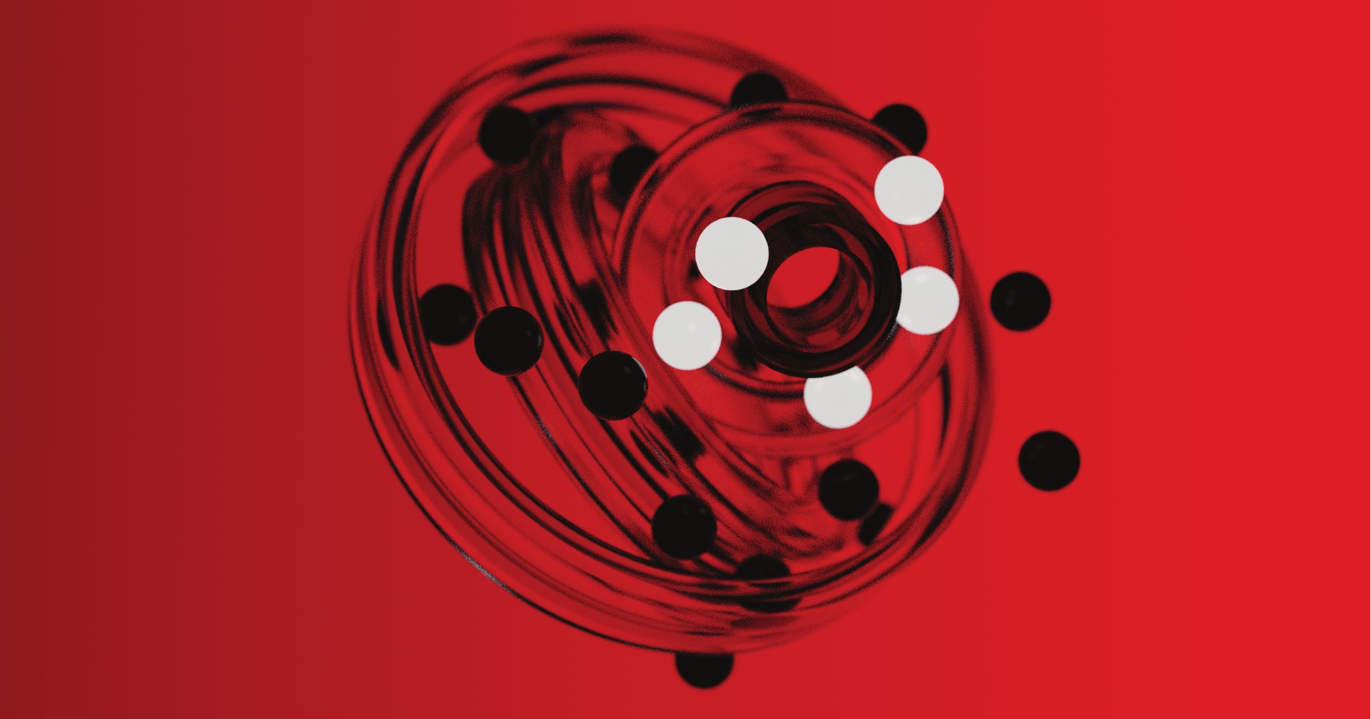
Glass bearing render on red
One object, one colour field, motion as blur.
Steel bearing render
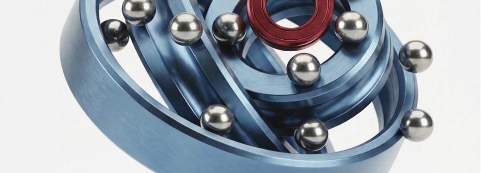
Cool metal, one red part, a light field.
Section pattern: a hatched field of bearing races, balls and full circles
Section field, seed 1907.

10

codex. engine

Experiment
Render
Palette
Source

10

codex. — the free sub-brand

codex. is where Third Bearing experiments with code, digital, AI and everything avant-garde. Inside codex., the rules of this document are material, not law.

What codex. may do

  • Any colour and any ramp. The five brand colours are optional.
  • Glitch, sort, datamosh, feedback and melt anything, the logo included, when the piece is labelled as an experiment.
  • Mix Apsis skins inside a word; use Pixel, Dot, Line and Mesh, and build patterns from Apsis Kit.
  • React to people: pointer, touch, microphone, a photo they bring. Always opt-in, never recorded, never uploaded.

What codex. keeps

  • Real input. Every piece starts from something real: our toolpaths, the logo geometry, the archive, a measured sound, or a photo the viewer chooses. Never scraped images.
  • A label. /item: experiment nn, seed and date. The same seed and source give the same piece.
  • One fixed thing. The grid, the mark or the palette (chapter 09).

Renders

FieldEvery pixel through the false-colour ramp.
DotRound dots on a grid of cells, diameter by value: a halftone.
PixelSquare cells in five steps of value, with a hairline gap: a pixel display.
GlyphLetters of Apsis Dot, Mesh and Pixel, chosen by how much ink they carry.

Your photo

Source → Photo… reads an image from your device into this page. It never leaves the browser and is gone when the page closes. Every experiment uses it instead of the mark: its brightness becomes the field, its dark areas become the shape that is sliced, sorted or grown.

The Codex Engine: ten experiments

01 Filament fieldThe source is sliced like a print: perimeters and 45° infill, turned into G-code. Particles travel the toolpath like extruded filament; the pointer is a nozzle that disturbs them.
02 Slit-scanThe spinning source is written into a time buffer. Each column of the image shows a different moment, so time becomes space.
03 Sort / moshPixels sort themselves by brightness, one swap at a time; pointer movement becomes motion vectors that drag the last frame along.
04 ReactionA reaction–diffusion system seeded with the source, grown in real time.
05 SignalThe manifesto read as a rhythm, or the room through the microphone, drives rings of the construction circles through a rotating feedback loop.
06 IllusionTwo optical illusions drawn from the mark, neither of which moves. Ouchi: a checkerboard of long bricks, turned 90° inside the mark, so its edge shimmers when the eye or pointer moves. Rotating snakes: rings of four tones that seem to turn, the mark reversing the order. Press to switch.
07 MoiréCircles (1) and (2) as ring gratings. Where they cross, interference: friction made visible. The pointer moves circle (2).
08 ExplodedThe mark's outline, extruded and cut into seven print layers, raymarched in real 3D over a print bed and pulled apart along the view axis, each layer turned a little more than the one below. The centre dot is a sphere that holds still. Press to explode; the pointer orbits the camera.
09 MeltBright parts of the source run downwards and pool, a little every frame. The pointer is a heat source: it liquefies what it touches so that a hole opens, leaves a glowing trail that keeps things flowing after it has passed, and drags the melt along. Press for more heat.
10 LayersThe source is printed bottom to top as layer lines. Line thickness follows brightness; hovering finds the nozzle and scrubs the print up and down.

References and distance

From Refik Anadol we take a principle: work made from one's own archive of data. We do not take his look (pigment-like fluid fields on large LED walls, latent-space morphing). From TouchDesigner practice we take common techniques (feedback, time buffers, pixel sorting, optical-flow moshing, reaction–diffusion, moiré, displacement) and apply them to our own geometry and printing data. Exploded takes a standard real-time graphics technique — raymarching a signed distance field — not exclusive to any artist or studio, and points it only at the mark's own geometry. Illusion is built on two published perceptual principles and credited to their authors: the Ouchi checkerboard (Hajime Ouchi, 1977) and the rotating-snakes tone ordering (Akiyoshi Kitaoka, 2003). We take the principle only — orthogonal bricks, an ordered black–dark–white–light sequence — and draw it with our own rings, our own tones and the mark as the mask; we do not reproduce either artist's artwork.

Palettes named after the workshop: Hotend (the nozzle at 215 °C), UV 405 (resin curing light), Bed (a thermal camera on the print bed), Phosphor (an old scope), Brand (the five colours).

11

Things we hand over.

Eighteen pieces, one system. Pick one from the index; click it to open the full piece.

11

Applications & documents

Company data

Legal namePT Poros Orbit Ketiga
AddressPerum Villa Tajur Blok D 2 No. 7, RT 004/RW 008, Kel. Sindangrasa, Kec. Bogor Timur, Kota Bogor, Jawa Barat 16145
Phone0877-6886-1215 (+62 877-6886-1215)
Emailthirdbearing@gmail.com
Instagraminstagram.com/thirdbearing · @thirdbearing
NPWP1000 0000 0993 4038 · legal documents only
Signs documentsMuhammad Aditya Wisesha, Direktur
Company codeTBS
Studio codesTBS studio. · TBO objekt. · TBX codex. — whichever sub-brand issues the document.

Where each item goes

Business cardName, role, email, phone, Instagram. No address, no NPWP.
Letterhead, envelopeLegal name and address; NPWP in the letterhead footer.
Quotation, invoice, receipt, BASTLegal name, address, phone, email, NPWP, document number, project code, bank details. See below.
Web, social, email signatureThird Bearing, email, Instagram. Never NPWP.

Email signature: brand-identity/v1.15/mockups/email-signature.html. Mockup source: brand-identity/v1.15/mockups/src/mockups.html, rendered by node scripts/build-mockups.js --v115.

Document numbers

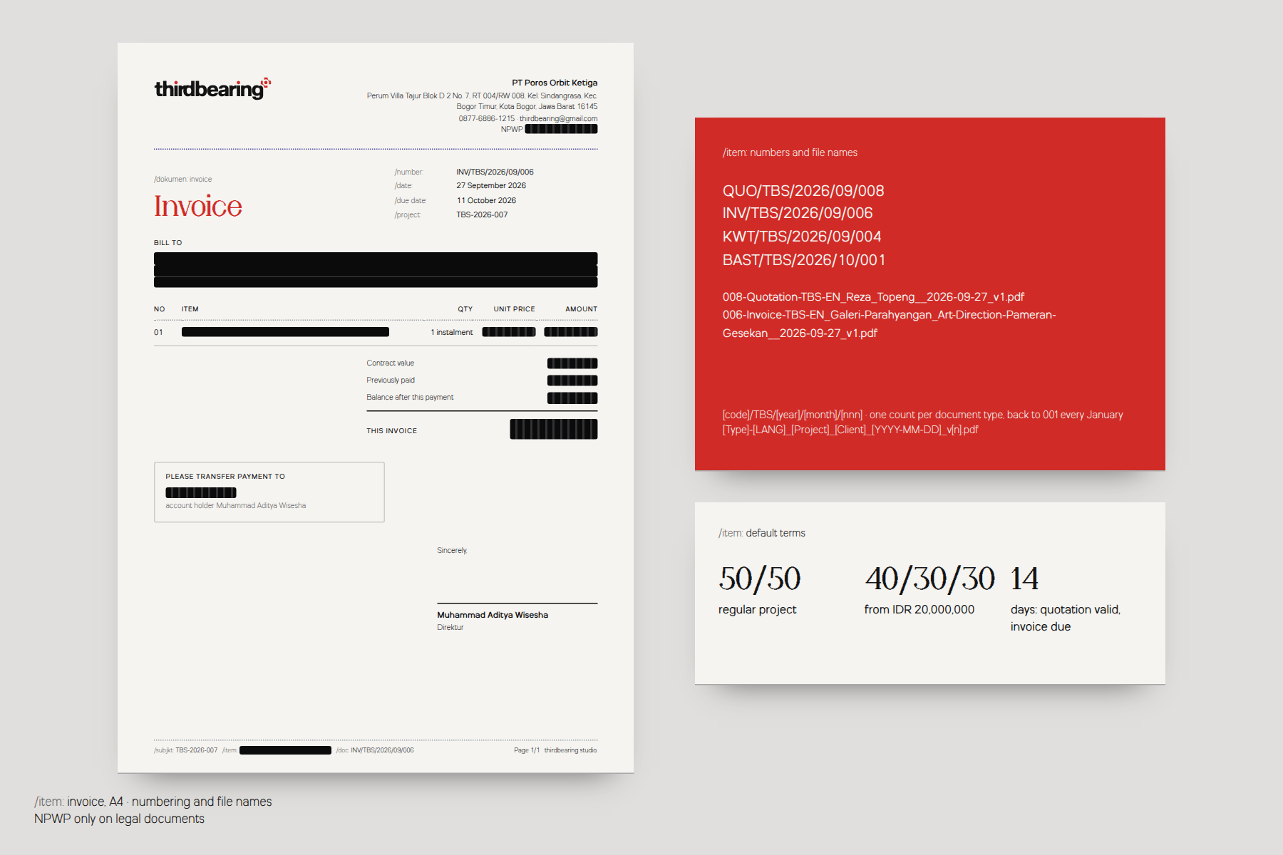
DocumentCodeExampleDates
QuotationQUOQUO/TBS/2026/09/001Valid 14 days from the date of issue
InvoiceINVINV/TBS/2026/09/001Due 14 days from the date of issue
Receipt (kwitansi)KWTKWT/TBS/2026/09/001Payment date and method on the receipt
Handover (BAST)BASTBAST/TBS/2026/09/001Date of handover

Format: [code]/TBS/[year]/[month]/[nnn]. The running number nnn counts each document type separately, has three digits and starts again at 001 on 1 January. The month only tells when it was issued; it does not restart the count. Every document also carries the project code TBS-YYYY-NNN.

Payment terms (default)

Regular project50 / 50: down payment, then settlement before handover.
Large project40 / 30 / 30: down payment, progress, settlement.
Large fromIDR 20,000,000 contract value.
Transfer toBCA 0860964546 · account holder Muhammad Aditya Wisesha

File names

[Number]-[Type]-[Studio]-[LANG]_[Client]_[Project]__[YYYY-MM-DD]_v[n].pdf

001-Quotation-TBS-EN_Reza_Topeng__2026-09-27_v1.pdf
002-Invoice-TBS-EN_Galeri-Parahyangan_Art-Direction-Pameran-Gesekan__2026-09-27_v1.pdf
003-Receipt-TBO-EN_Rumah-Lilin_Katalog-Produk-Rumah-Lilin-2027__2026-09-25_v1.pdf
NumberThe document's running number nnn, matching its document number above.
TypeIn the language of the document. EN: Quotation, Invoice, Receipt, BAST. ID: Penawaran, Invoice, Kwitansi, BAST.
StudioTBS, TBO or TBX — see studio codes above.
LANGEN or ID.
Client, ProjectAs written on the document. Spaces become hyphens; no other punctuation.
DateDate of issue, YYYY-MM-DD.
Versionv1, v2 … a new version for every change after sending.

Anatomy of a document

HeaderWordmark top left. Legal name (Nitride Demibold), address, phone · email and NPWP right-aligned top right. A dotted hairline in Purple Flame below.
Title/dokumen: invoice label, then the title in Apsis Regular, Red Hot Bearing. Number, dates and project code on the right, labels in Nitride Light /number: /date:.
BodyRecipient block (BILL TO / TO / RECEIVED FROM), items table with a dotted rule under the header, totals right. The total is the one other Apsis line.
CloseBank box, terms (quotation), signature block: name in Demibold, role Direktur.
Footer/subjkt: [project code] /item: [project] /doc: [number] left, Page n/N thirdbearing studio. right.
Invoice mockup following the document anatomy
Invoice, A4, in the numbering system above.

Mockups

12

The third one holds still.

Every file in the kit is generated from two sources: the logo geometry and the tokens. Nothing is drawn twice.

Founder
Muhammad Aditya Wisesha
Company
PT Poros Orbit Ketiga
Studio
Perum Villa Tajur Blok D 2 No. 7, Bogor Timur, Kota Bogor 16145

© 2026 Third Bearing. All rights reserved.

12

Files, changelog & contact

FolderFilesWhatUse for
assets/brand/svg/mark/7Mark in red, white, deadmetal, purple; small for 16–24 px.Web, UI, any vector use.
assets/brand/svg/wordmark/10Horizontal and vertical, on light / dark / red, mono dark / light.Default logo.
assets/brand/svg/lockup/30 (+10)studio. / objekt. / codex. lockups in the same variants. The 10 printing files are retired.Pieces of one sub-brand.
assets/brand/pdf/57Vector PDF of every SVG master.Print shops, Illustrator, InDesign.
assets/brand/png/228Every master at 256 / 512 / 1024 / 2048 px, sRGB, clear space included.Office documents, slides.
assets/brand/favicon/ · social/6 · 3Favicons, app icons, manifest · avatars, Open Graph image.Web and social profiles.
assets/brand/pattern/8Section tile and Section field in four colours (tb-pattern-section-*). The Truchet files beside them belong to v0.3–v1.1.Backgrounds, packaging.
brand/tokens/3tokens.json (source), tokens.css, contrast matrix.Any code.
brand-identity/v1.15/—This deck, the print document, mockups, brief, static PDF.Reading, sharing inside the studio.

Changelog

VersionDateChanges
1.155 Oct 2026A new brand pattern, Section, in place of the Truchet field: the bearing drawn as a cut (race, ball left whole with its centre lines, circles (1) and (2) as bites, housings hatched across each other with the seam drawn), from the mark's own numbers. Meet is played on it: turn the cells until four bites close a circle. New files tb-pattern-section-*.
1.13 Oct 2026Chapter 09: the poster is redrawn on the Nitride poster system (400 × 500 mm, 18 × 23 cells, the F one cell per v with its construction). The slider still runs it from industrial to experimental: the F turns a quarter and gains weight on Nitride Variable, the field slips in module steps while the construction holds, red floods the sheet at 51, the title takes its Apsis skin. Export as PNG (3200 × 4000) or SVG. Fixed: the poster had stopped drawing in 1.0, because the pattern game's drawing function replaced the poster's inside one scope.
1.03 Oct 2026The first complete edition. Chapter 09: the Truchet tile becomes Meet, a game of ten one-minute levels (turn the tiles until every arc meets; a met path lights up and scores; red button, 3-2-1, timer, bonus, score board in this browser). The old toy's fast-click bug is gone (a tile could stop between two quarter turns). Chapter 06: Nitride's tracking follows the weight continuously instead of stepping at Bold and Black; grid labels no longer overlap at small sizes. Chapter 05: Develop keeps the Mixed skins. Chapter 01: the sign-off under the manifesto is removed, on both sides.
0.92 Oct 2026Nitride and Apsis final. New chapter 06, Nitride: a variable-weight tester with the font's own grid lines, the grid (one unit v = 53), six weights on one ratio, the text scale, rules and features, and Nitride Variable (wght 300–900, roman and italic; its named instances are the static fonts). Chapters 06–11 become 07–12. Apsis skins cut in Light, Regular, Medium and Bold, each with an 8° italic matching Apsis Italic (they were Regular and Bold only, and the browser faked their italic at another angle). Poster board: the Nitride key poster and posters 05 and 06. Chapter 07: the spinner stays inside its stage at any angle and any screen.
0.830 Sep 2026The studio's own type. Nitride (text) replaces Futura 100 and Apsis (display) replaces Proximity; Apsis Line, Mesh, Dot and Pixel replace the Proximity skins, and Apsis Kit joins as the codex. construction set. Sub-brand descriptors redrawn in Apsis Bold with the turned e (studio. objəkt. codəx.); the plain e stays the default. Apsis 3 (1 Oct): redrawn as a flat-pen contrast serif with bearing-ball terminals, pixel-stepped curves and bitten-pixel dots, Light to Bold with italics, kerned, and cipher letters for codex. Chapter 05 rewritten; the type lab gains Medium and a turned-e switch. Fonts load from brand/typeface/, so no licensed fonts are needed to build the deck or its PDF.
0.7529 Sep 2026A third owner review, in five parts. Sound rebuilt as a synthesised instrument: relay clicks, steel rings on one pentatonic scale, a stepper kick, a heavy-start long-stop flywheel, a blast at 99,999 rpm, and a print-in sweep for the lightbox. Chapter 04's palette bar no longer shakes between white and black (the hovered segment was shrinking away from the pointer; the choice is now made against fixed boundaries, with hysteresis). Codex Engine: 06 is an optical illusion (Ouchi, rotating snakes), 08 an exploded 3D print, 09 Melt reacts to the pointer (a heat source that opens a hole and leaves a trail), and the control panel got room between labels and buttons. Chapter 10: a piece is printed in layer by layer, with what it is beside it.
0.628 Sep 2026A second owner review, all of it on chapter 10: the 3D carousel and thumbnail strip replaced with a numbered, category-grouped index next to one large flat preview; a click opens the lightbox (full-size image, caption, prev/next, focus trap, Esc to close); the business card no longer rotates in a 3D ring, which was softening its live text on ordinary screens; its back mark, previously cropped off the card, resized and repositioned; and the file naming convention gained a running number and a studio code (TBS/TBO/TBX).
0.528 Sep 2026Eight fixes from the owner's review of v0.4: the objekt. particle render corrected to size; all nine misuse examples reachable; the chapter 06 spinner rebuilt (heavy start, long stop, scroll wheel, a 99,999 rpm easter egg); Codex Engine experiments 06 and 08 replaced with real-time 3D (Relief, Orbit) and the control panel redesigned; chapter 10 rebuilt around a 3D carousel; the chapter dial's centre hub given spring physics instead of a snap; the licensed fonts installed, so the PDF and every mockup render in Proximity and Futura 100; client data in the document mockups redacted.
0.427 Sep 2026One scroll, one chapter. Calculated screen grid and one composition for every chapter. Shorter manifesto with a pull interaction. printing. merged into objekt.. Plainer voice. Pixel and Dot at 25 / 50 instead of the solid 100. Codex Engine: photo input, distinct Dot / Pixel / Glyph renders, ten experiments. Document numbers and file names. Static PDF rewritten for print, with page numbers.
0.327 Sep 2026Deck rebuilt as an instrument. objekt. added; company and owner data; art direction 70 / 30; codex. freed, Codex Engine; Proximity documented with the real fonts; boxy tee; invoice and job sheets.
0.2Sep 2026Vector masters, clear space, sizes, misuse, tokens, HTML master, mockups.
0.1Sep 2026First draft: manifesto, mark, logotype, sub-brands, palette, typography.

Full list: brand-identity/CHANGELOG.md. Decisions: brand-identity/DECISIONS.md.

Contact

Brand owner and approvals: Muhammad Aditya Wisesha, Founder.
PT Poros Orbit Ketiga · Perum Villa Tajur Blok D 2 No. 7, RT 004/RW 008, Kel. Sindangrasa, Kec. Bogor Timur, Kota Bogor, Jawa Barat 16145.
0877-6886-1215 · thirdbearing@gmail.com · instagram.com/thirdbearing

Colophon

Set in Nitride and Apsis, the studio's own typefaces (brand/typeface/). Built with HTML, WebGL2 and GSAP. Particles, toolpaths and glitches are computed live from geometry.json and tokens.json.